Significant progress in native drawing
Until recent days, goal rendering in “development” mode didn’t look pretty, and its usefulness was restricted:
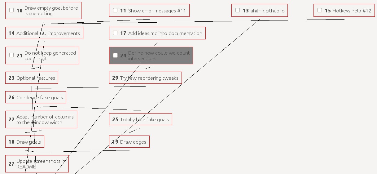
Main problems were:
- Edges intersect goals and reduce readability
- Edges intersect each other
- Goals are always tied to the left side of screen
A simple trick has made look much better. Just compare this picture with the above one. Both of them display the same data.
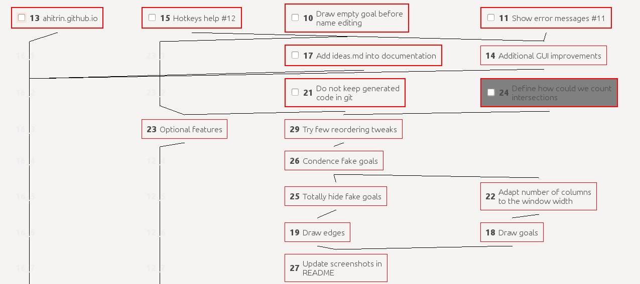
What’s the source of this improvement? It’s fake vertex, that are created for all edges that cross graph layers. Every such intersection becomes a new “fake” vertex. Then we reserve space for all such vertex and sort them along with real ones in order to reduce edge intersections.
As a result, we see significantly less amount of intersections here. Graph becomes much readable and nice to view.
Of course, current rendering is not perfect yet. I’m not sure it could even be mathematically perfect at all (since the problem of minimizing number of intersections is NP-hard). But I need to improve rendering, especially for large graphs (where we get a lot of long egdes and, accordingly, a lot of fake vertex). I have several ideas (taken from papers and my own observations) how to do it.
But the main news are quite simple: you should try new mode if you haven’t done it before. Rendering with dot is on its way to total deprecation. Maybe this could be done even in several weeks!